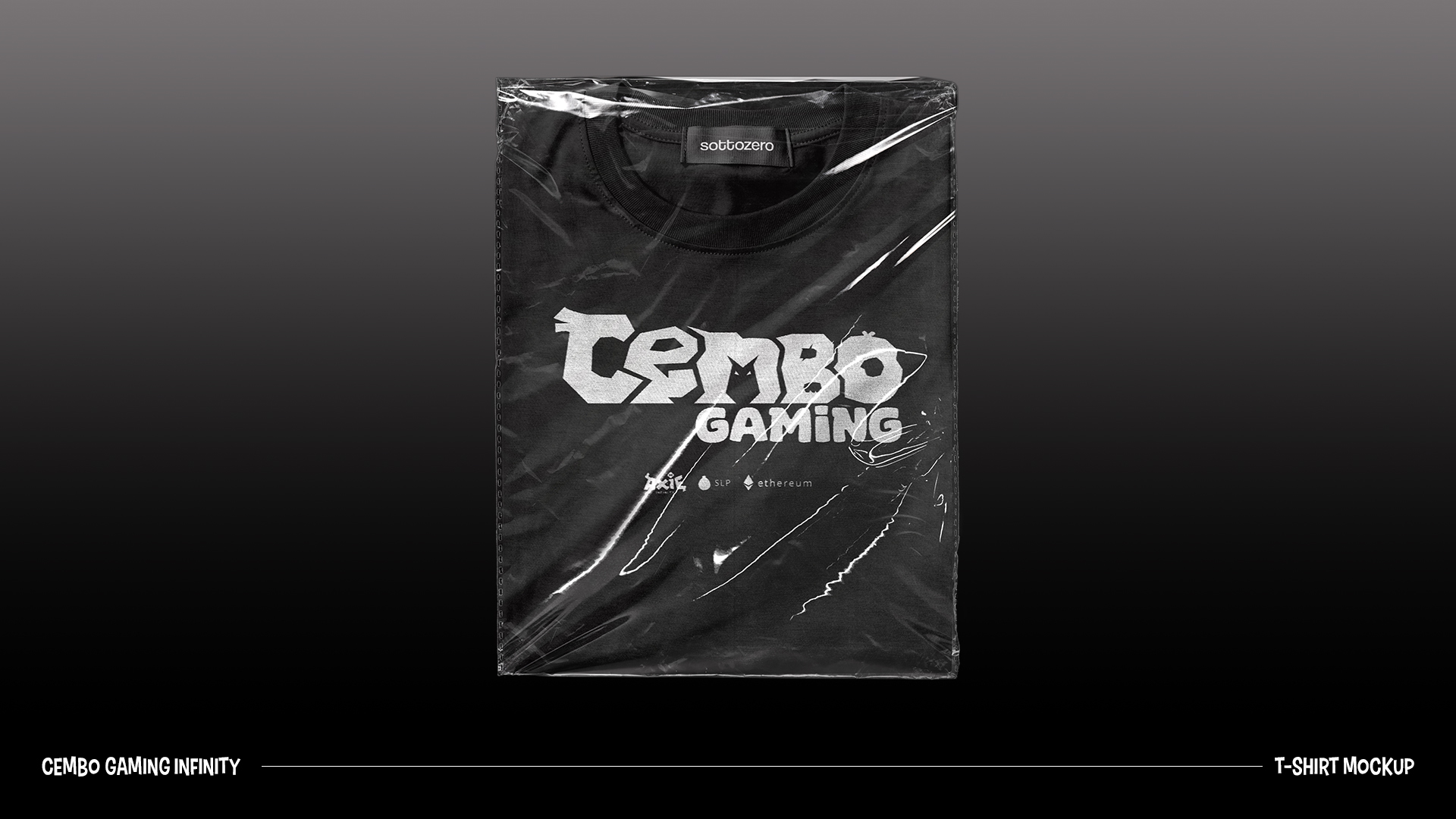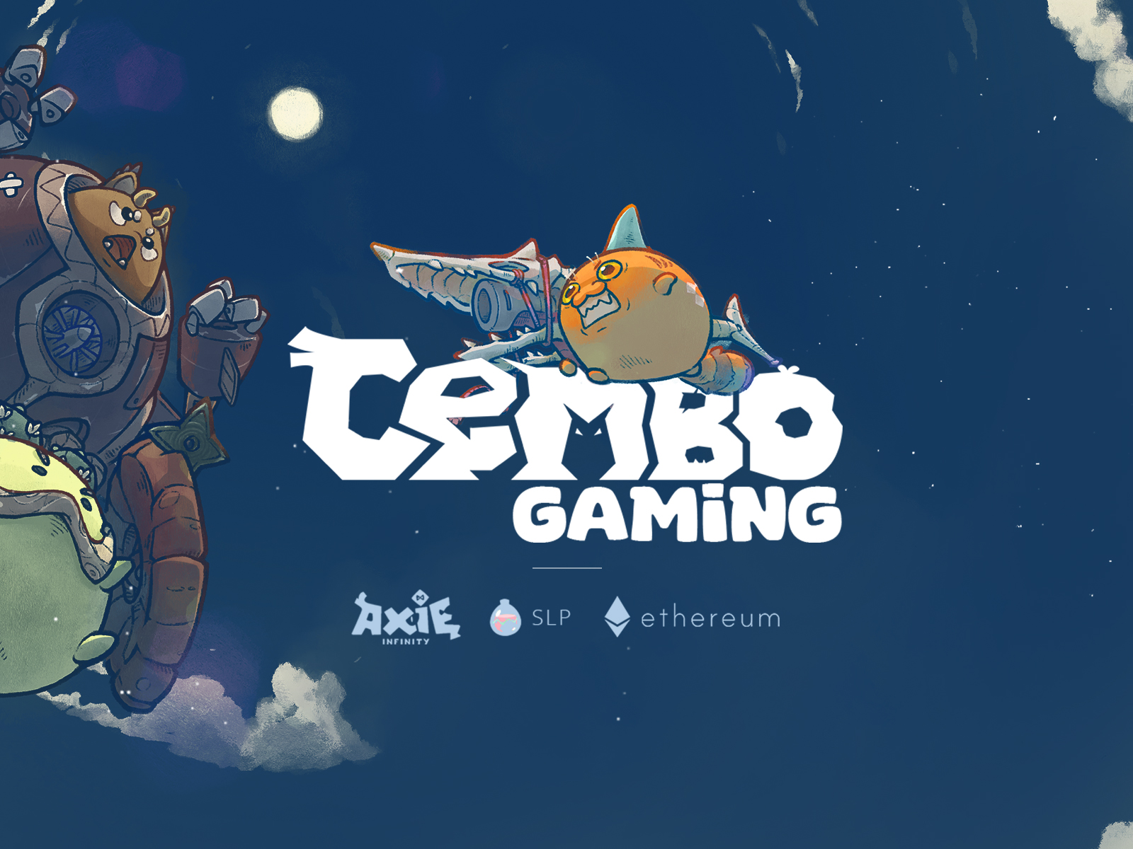
This is Cembo Gaming Infinity.
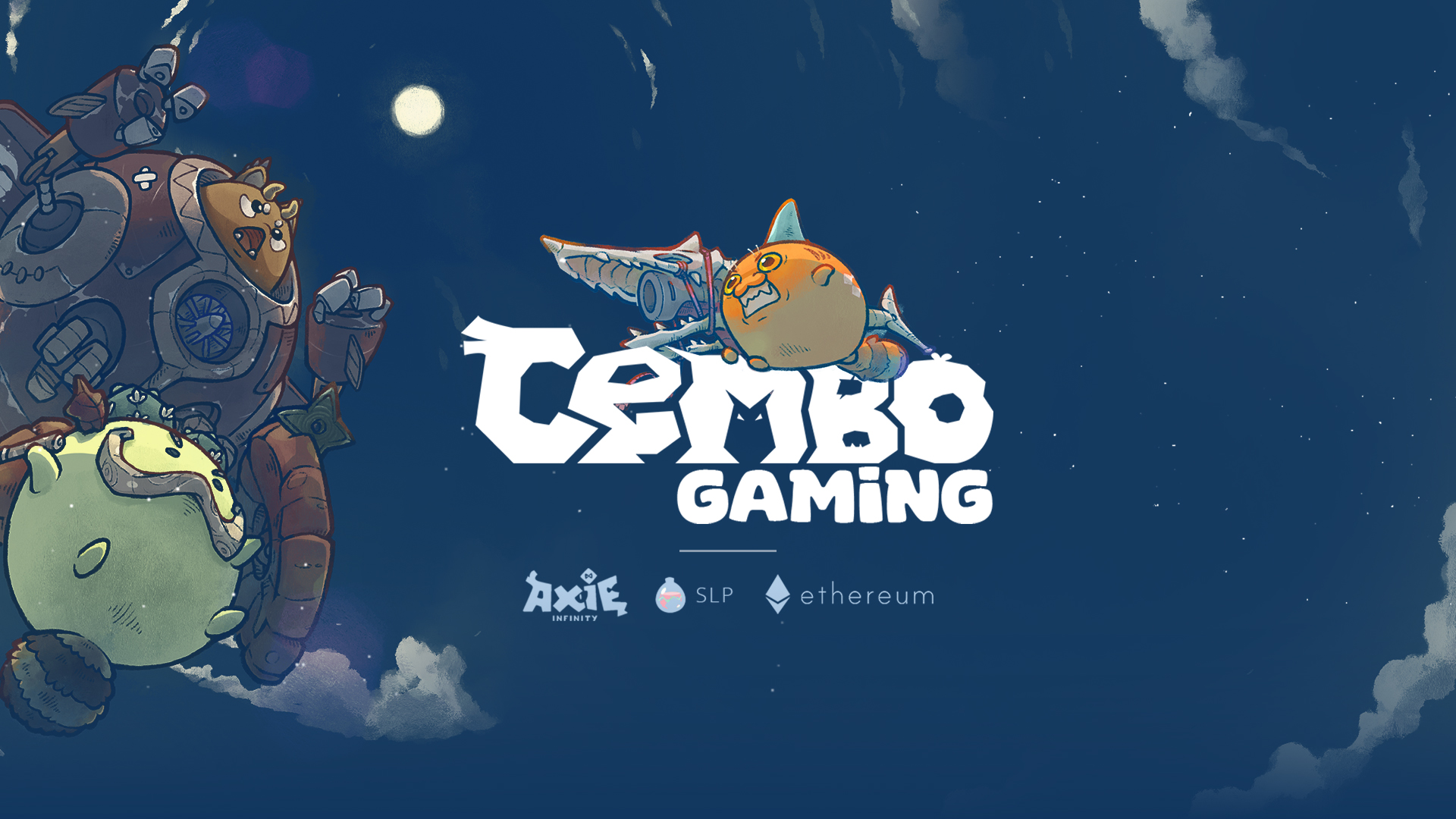
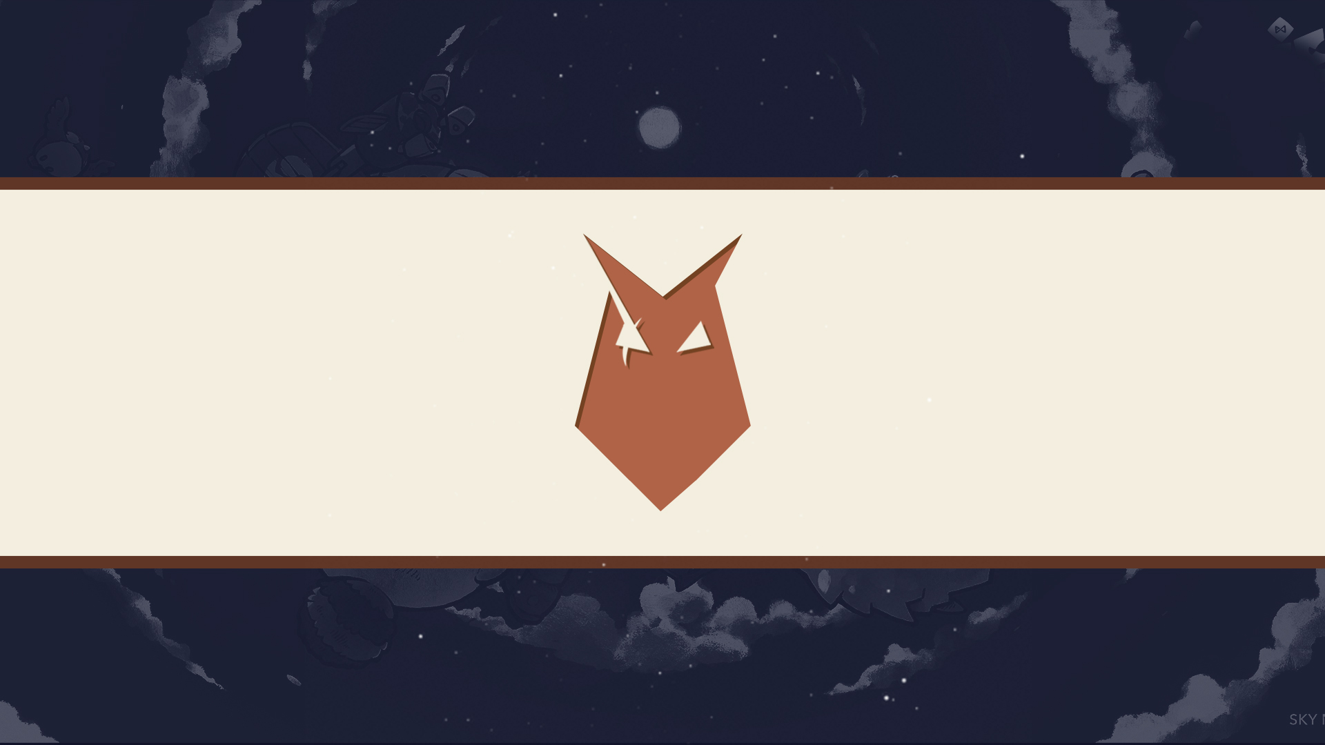
Started in 2021, this project was commissioned which revolves around being playful yet being serious. This brand's main focus is Axie Infinity and I mainly used few colors from Axie Infinity to make the correlation easier for people who will view the publicity materials. For the primary logo, I illustrated the letters to have similar features as axies, and added a 'mini' axie on M to stand as submark logo.
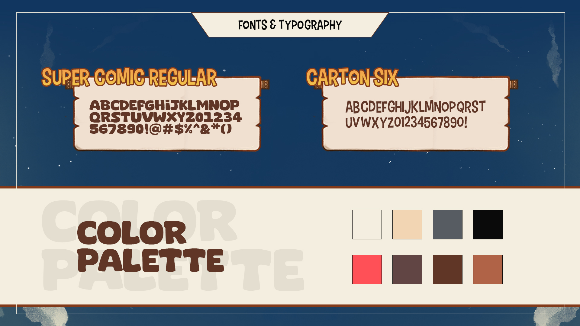
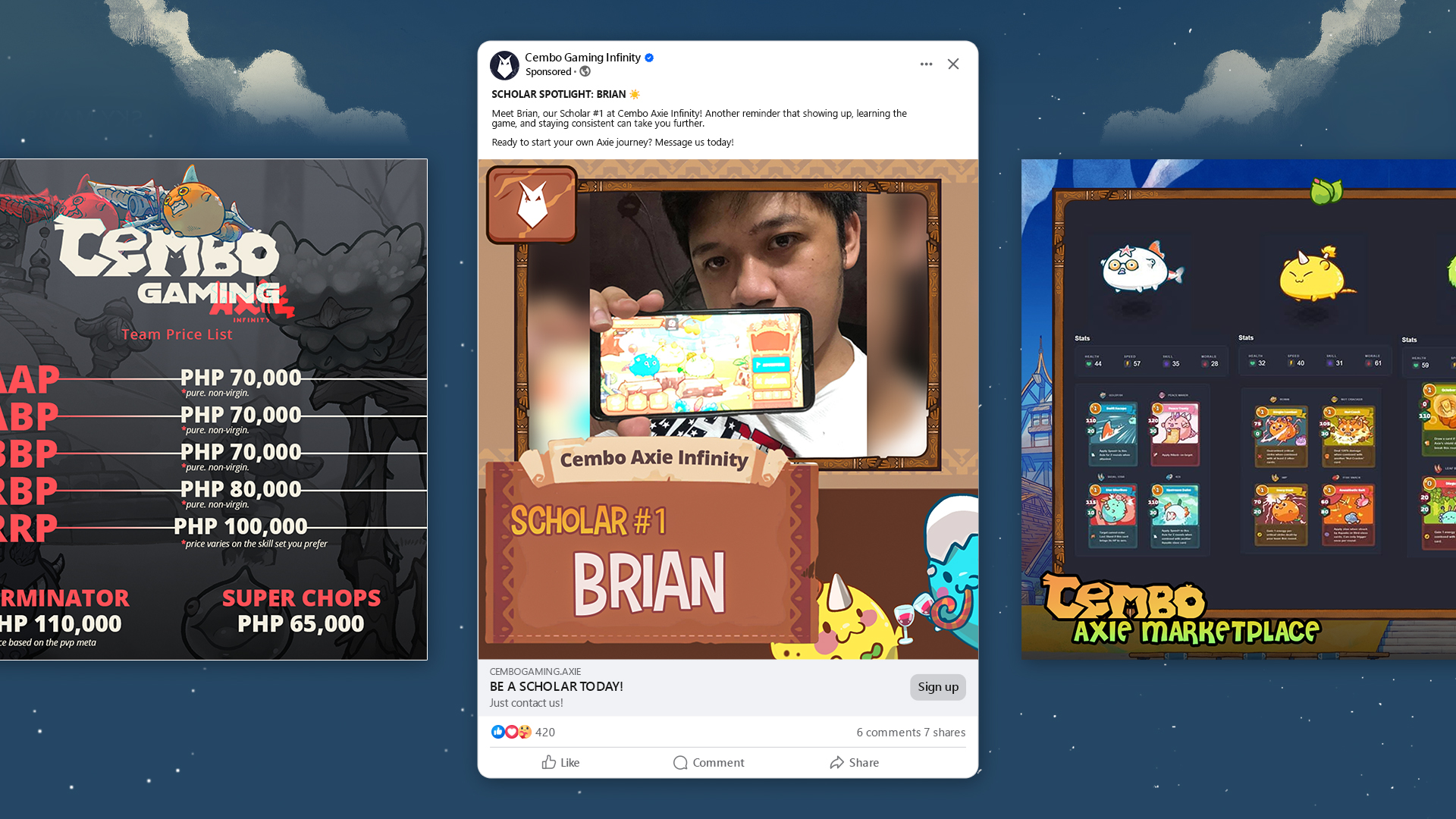
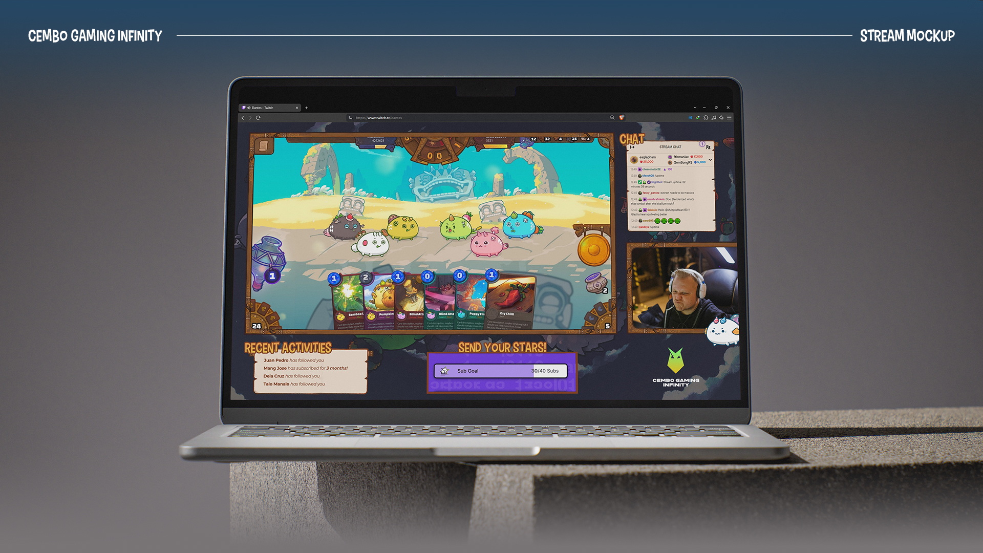
The main look that I went for is the scroll-like containers for headers or titles, wood or brown border, and the fonts used is Carton Six for the 'crooked' look, which represent wild and wood; Open Sans for uniformity, and Super Comic Sans for heavy titles.
Looking back, there's a lot to improve in my color palette and execution on mocks, but since it's 5 years from now, I'm still proud that younger me was able to finish it.