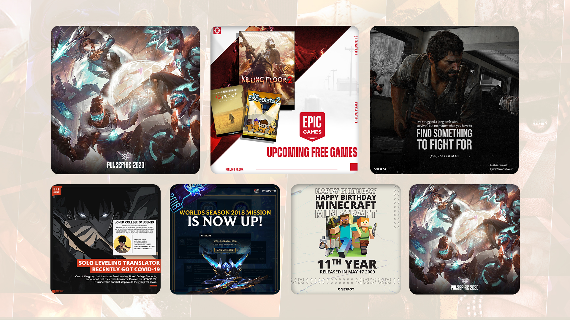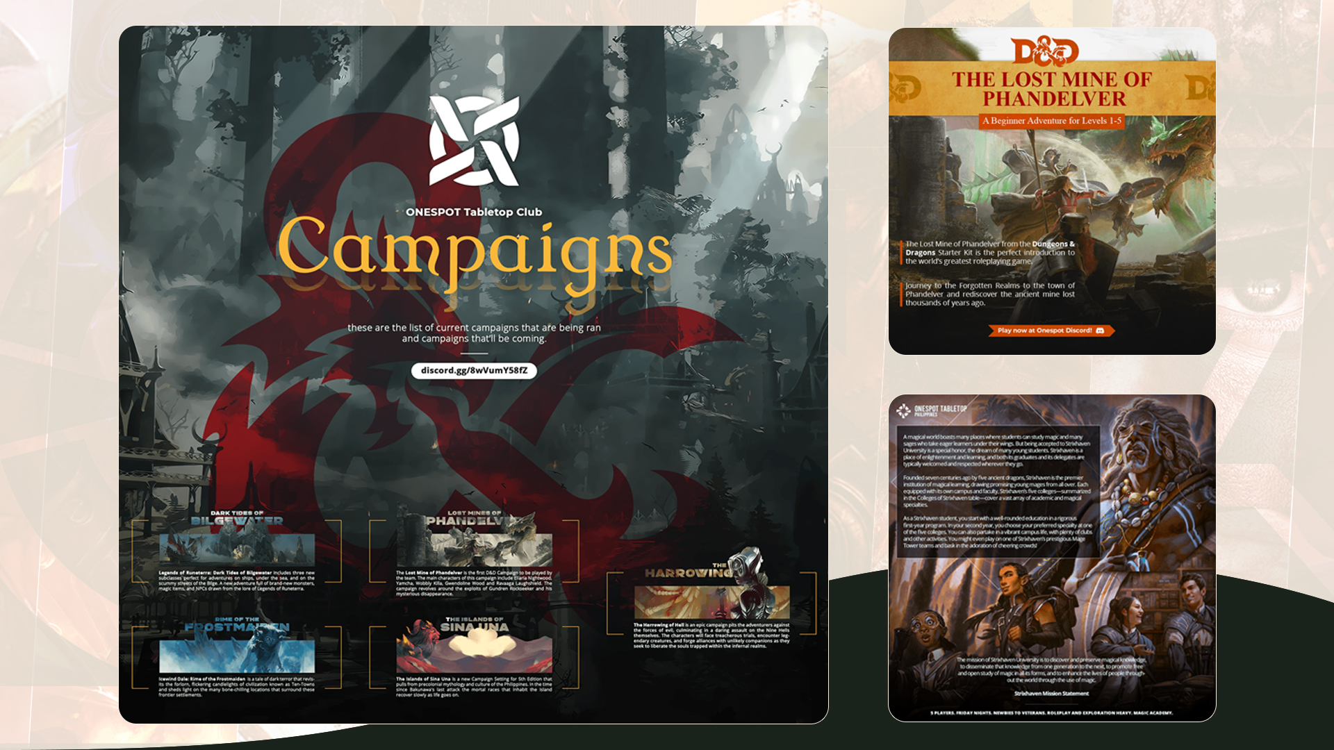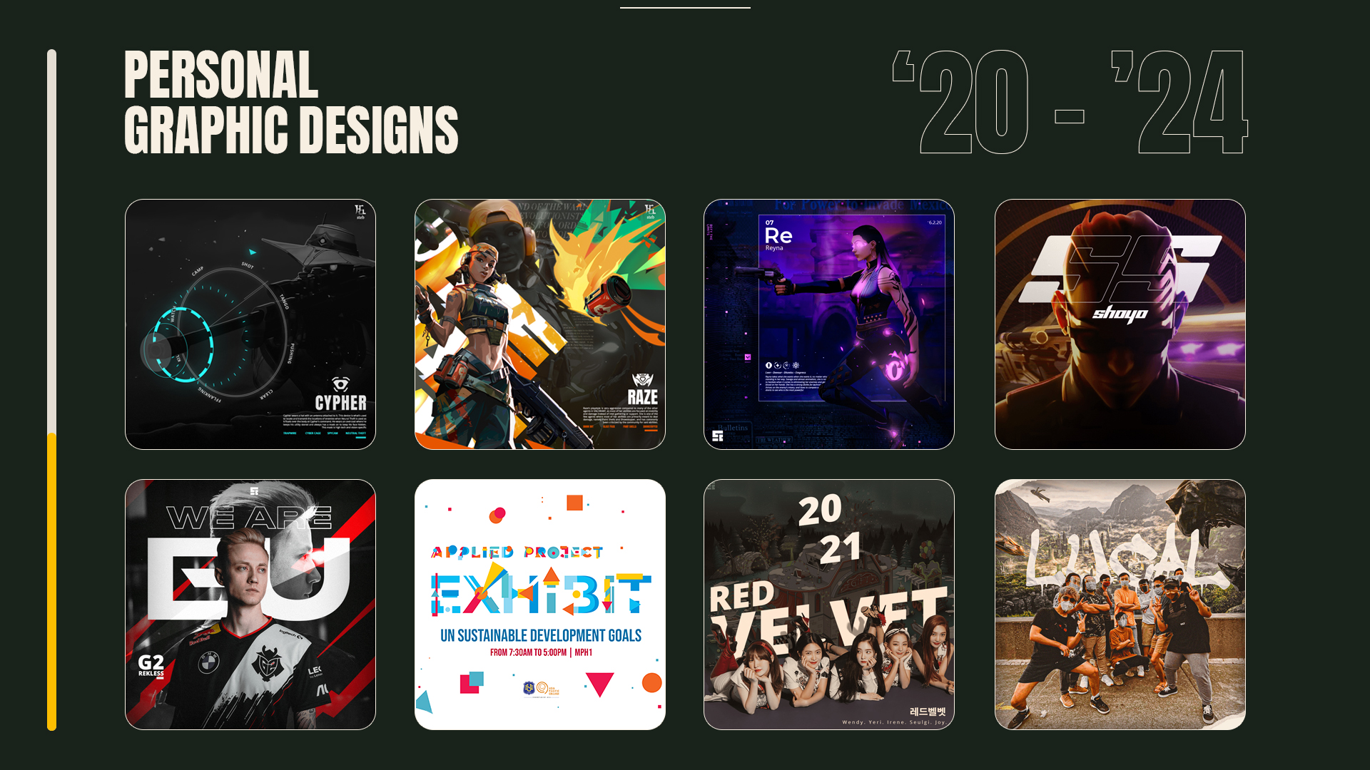
This folio gathers the work that shaped my early design language: direct layouts, heavy contrast, campaign-led graphics, and identity pieces built to move quickly across different formats.
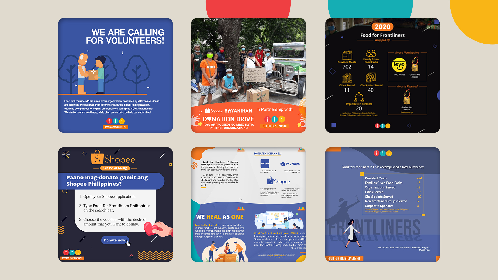
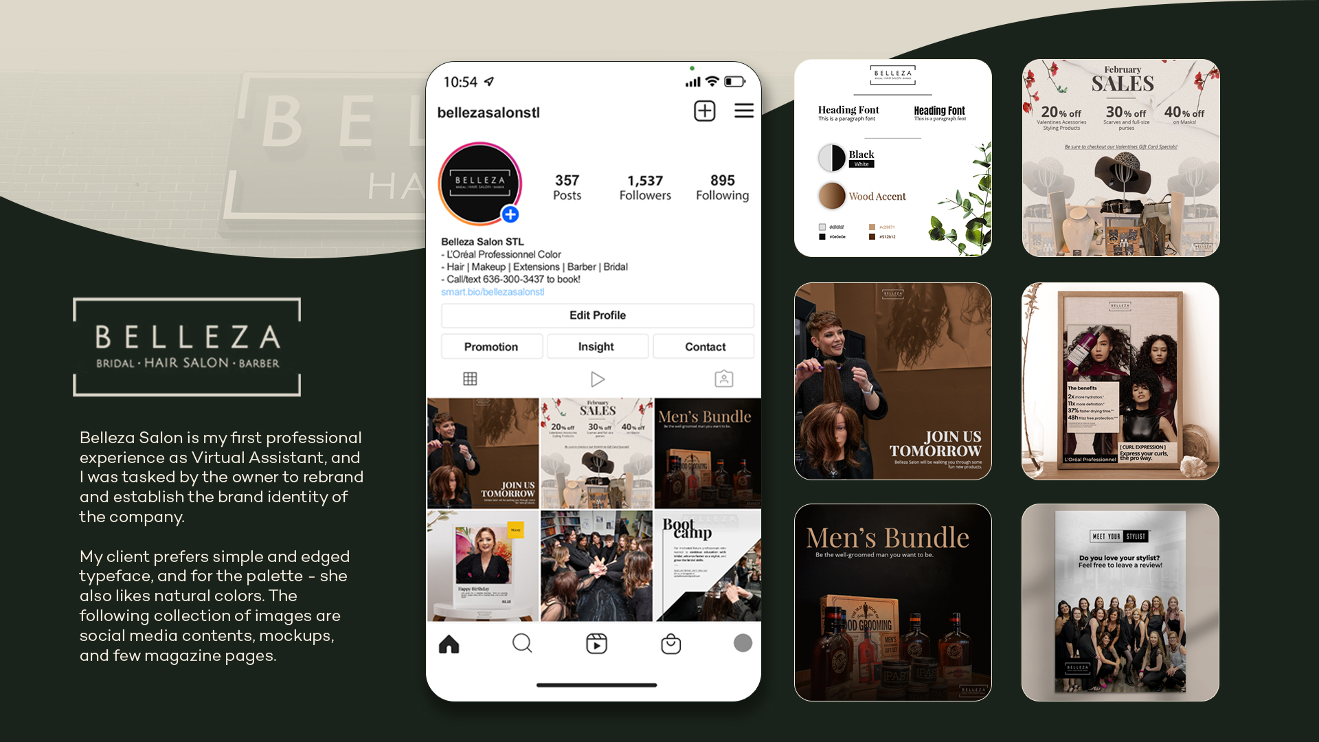
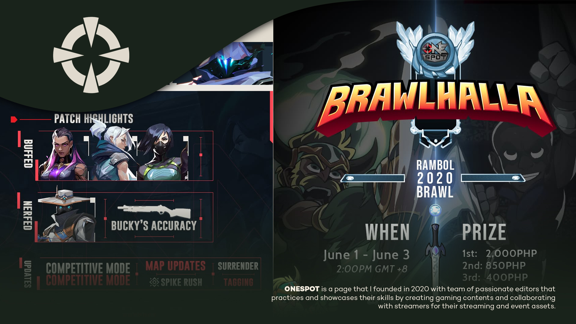
Across the boards, the work moves between food and volunteer campaigns, beauty and lifestyle branding, game-community posters, event promotions, and personal graphic studies. Each piece was treated as a small system: a cover, a social post, a key visual, or a layout family with enough structure to stay recognizable.
My role centered on design direction, visual identity, and social media graphics. The main decisions were about hierarchy, type weight, color contrast, and how much energy each format needed before it became too loud.
Looking back, this period feels like a younger me who's being more practical, exploratory, and sometimes intentionally intense. It shows the beginning of a visual habit I still use now, where graphic design becomes a way to organize attention, not just decorate a surface.